What they all agreed on was the view: a magnificent expanse of Biscayne Bay with its beautiful and soothing blues and greens—it was unparalleled. What the homeowners and their design team were less sure of was what to do about the house in front of that view. The Mediterranean-style home in Indian Creek Village, built in the 1950s and renovated in the ’70s, had been abandoned and become uninhabitable. “But I rallied to have it saved and not go the way of a teardown,” says designer Constantin Gorges. He and the rest of the team realized that the expansive house had much to recommend, if you looked past the surface. The bones of the house were very strong and “the integrity of the home was timeless,” says builder Pete Torres. So the owners decided to have the house undergo an extensive renovation.
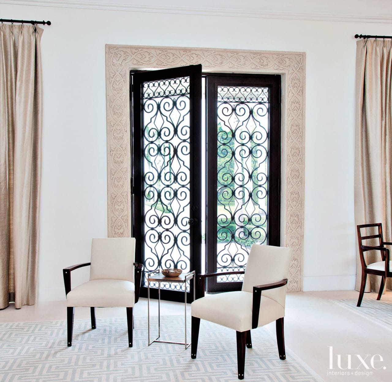
Architect Zeb W. Jarosz began the initial phase, redesigning the layout and space planning, and reinforcing and implementing alterations to the existing structure. Continuing the momentum, Gorges and Torres redid every surface and finish inside, fabricated custom doors and moldings, designed and implemented a copper gutter system outside, and preserved just a select few interior details from the original house, including a handful of decorative metal doors and a selection of wood-framed French-style windows, which needed to be meticulously restored. “We decided to salvage some of the windows to keep the character of the home,” says Torres.
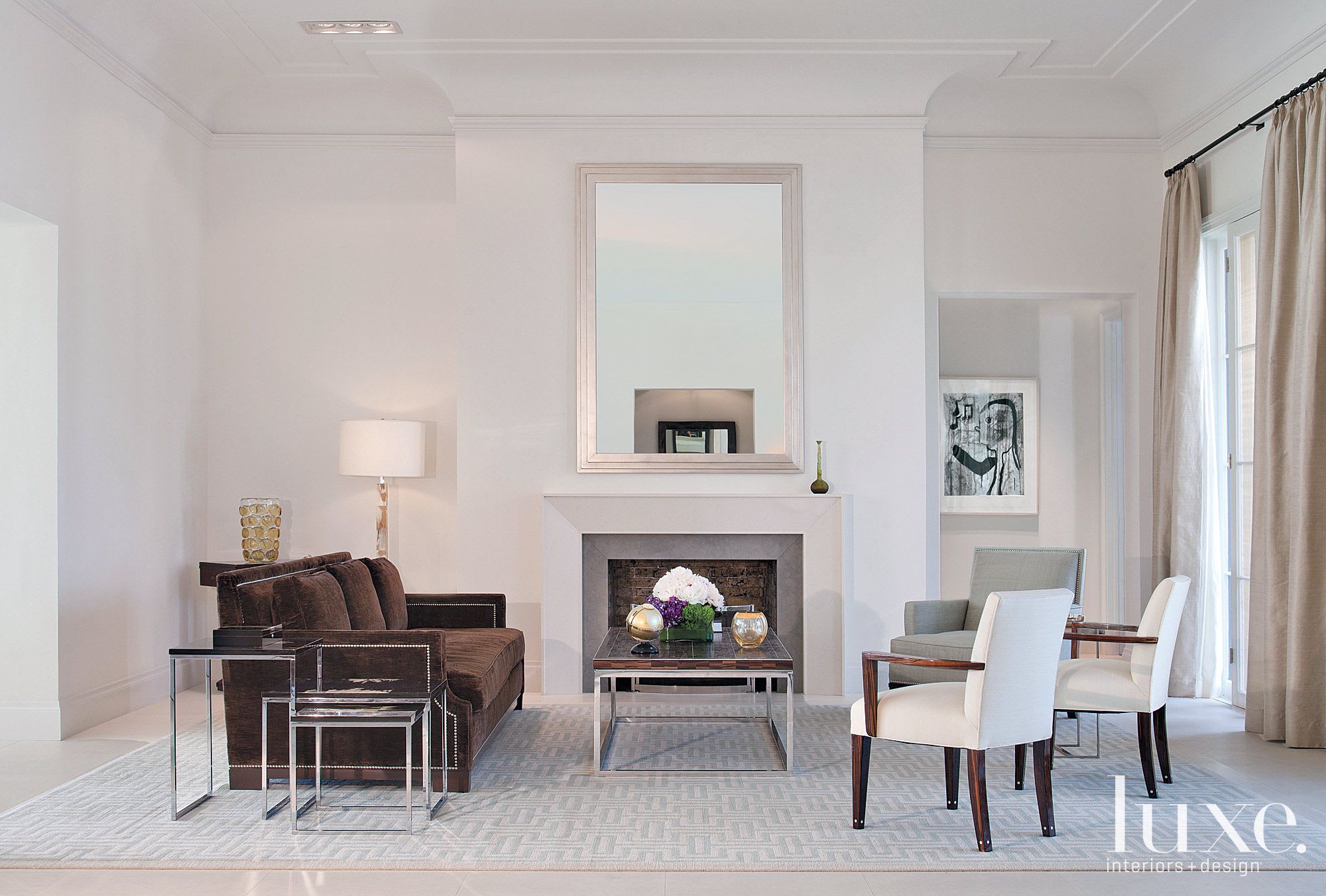
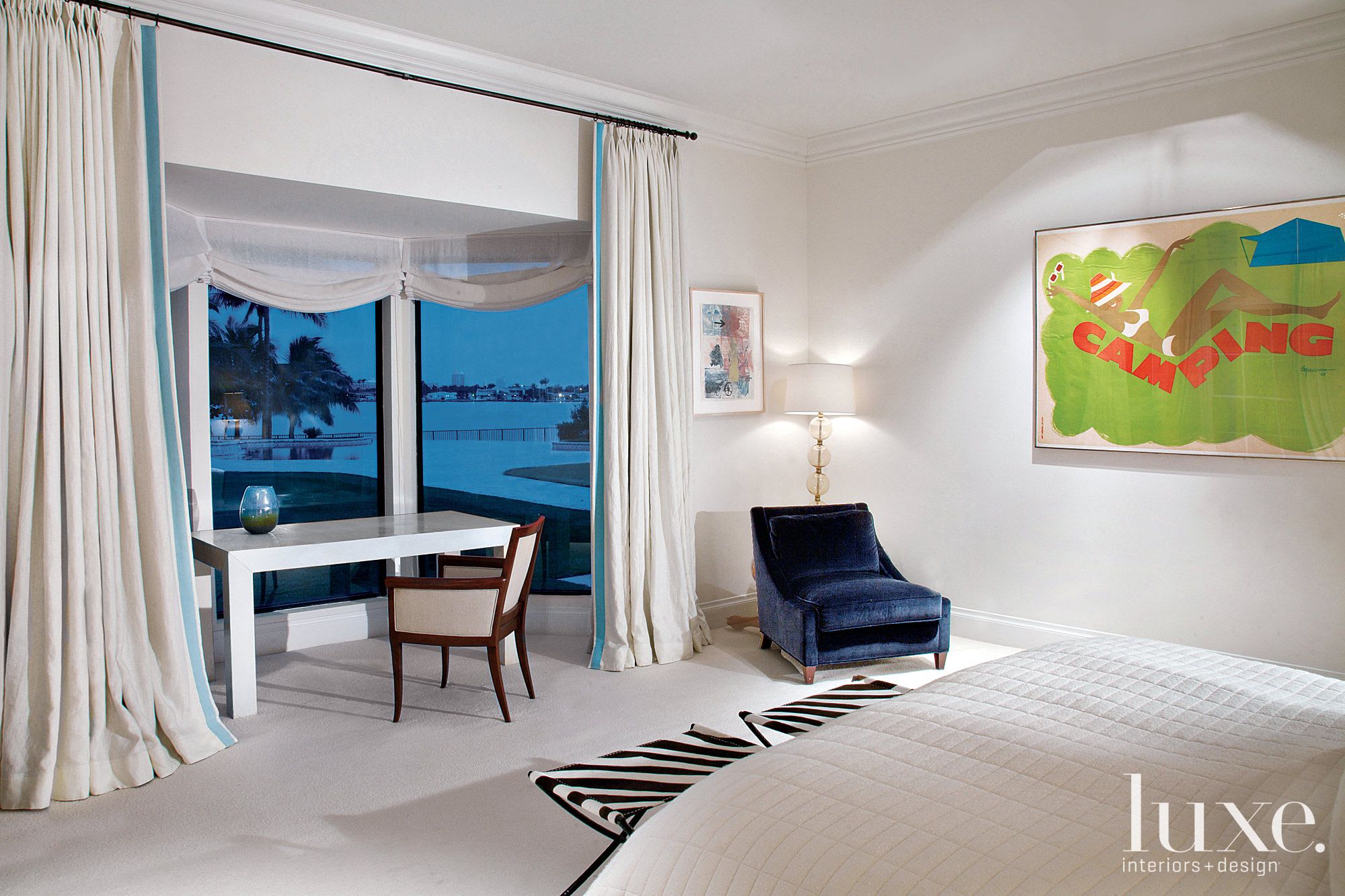
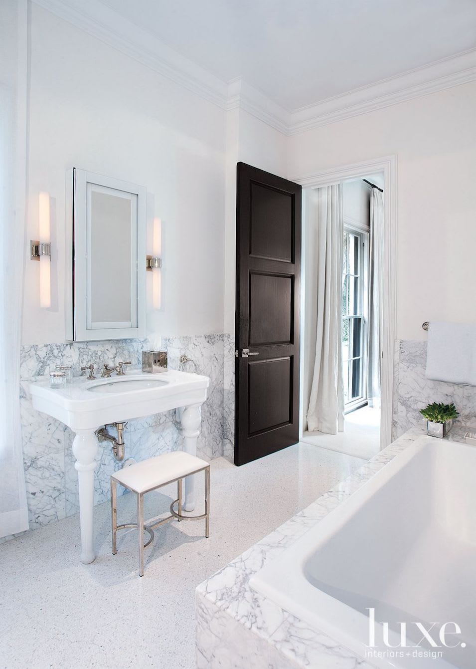
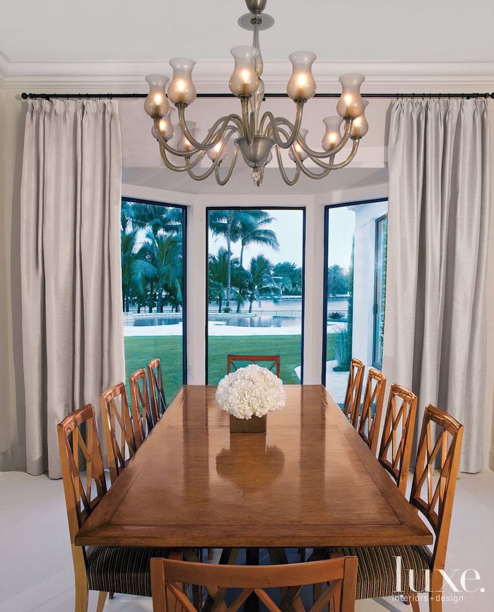
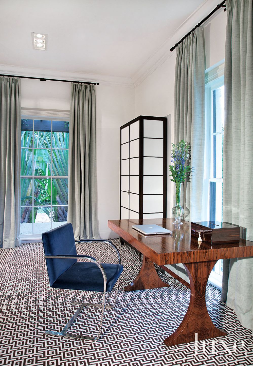
For the interior aesthetic, Gorges wanted a look that expressed the sophistication of the couple: New Yorkers who have affiliations with the arts. “The look is transitional—not contemporary, not traditional,” the designer says. He wanted a pristine look that was not overly done, with hints of color to warm the overall scheme and complement their extensive art collection. The designer chose natural tones—ecrus and soft blue-greens—and interrupted them with hues that reflected the surrounding sea: royal blue in the library and navy in the master bedroom. He then added contrast with flashes of ebony or chocolate brown, such as the sofa in the living room, that give the design a rootedness. “It’s a soothing, natural juxtaposition of color,” he says. “It results in a very timeless look.”
In each space, Gorges tried to use similar colors but alter textures. “I wanted to repeat the shades of the sea, but have a vibrancy that came from different fabrics and patterns,” he says. In the library, for instance, the silk draperies are the same soft blue-gray as the bergère, but the textures vary. This color scheme was part of Gorges’ plan to connect the interior and exterior. He wanted a seamless progression between indoors and the outside. “You have those beautiful vistas of pool and water,” he says. “So we created a harmony between the inside and out—a very fluid transition.”
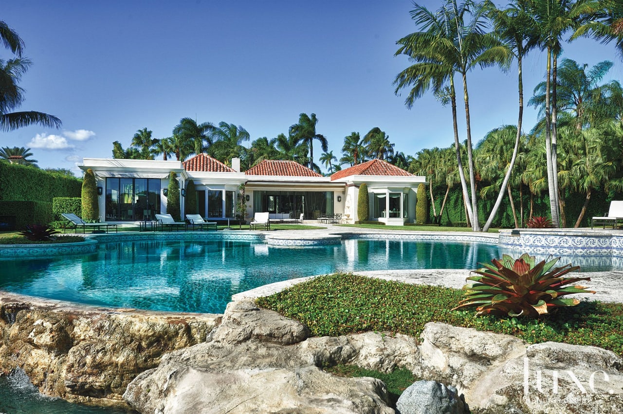
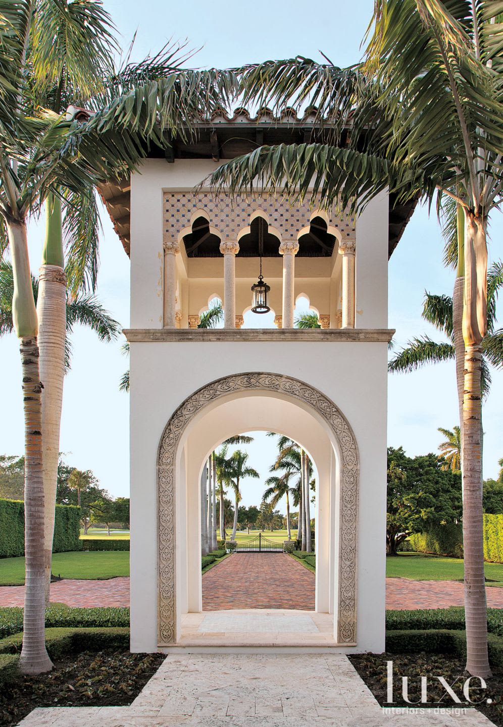
The property boasted a lovely curved pool and palms outside; landscape architect George Keen supplemented the scenery with indigenous tropical plants and more palm trees, and replaced the existing brick hardscapes with Dominican keystone. The final conundrum was a tower in front of the house in a style Gorges calls Mediterranean Moorish, an Alhambra-influenced piece of entry architecture that had been added in a previous renovation. “We debated whether or not to keep it,” says Gorges. “In the end, we decided to preserve it because of its scale.” Like the exterior, the interior reflects a design sense from many time periods, and it ought to last through many more, says Gorges: “This kind of transitional look doesn’t go out of style.”
